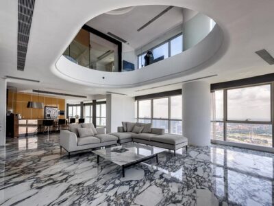
In the world of architecture and interior design, colours are far more than mere decoration—they are powerful tools that shape spaces, influence emotions, and define experiences. For architects and interior designers in the UK, where architectural styles range from historic stone cottages to sleek urban apartments, mastering the use of colour is essential to creating impactful designs. Here’s why colours hold such significance in this creative field.
1. Colours Set the Mood
Colour has a profound psychological impact. A soft grey-blue in a bedroom can evoke calm and serenity, perfect for rest, while a vibrant mustard yellow in a kitchen might energise and inspire conversation. As an architect or designer, understanding how hues affect mood allows you to tailor spaces to their purpose—whether it’s a cosy family home in the Yorkshire Dales or a dynamic office in London’s Tech City. Clients may not articulate it, but the right palette makes a space feel intuitively “right.”
2. They Define Spatial Perception
Colours can manipulate how we perceive a room’s size and shape—a critical skill in the UK, where space is often limited. Light shades like cream or pale green reflect light, making cramped Victorian terraces feel airy and open. Conversely, darker tones like charcoal or navy can add depth and intimacy to larger, loft-style interiors. Architects use this trick to enhance proportions, turning awkward layouts into harmonious designs that defy their physical constraints.
3. Colours Reflect Identity and Personality
Every client has a story, and colour helps tell it. A bold red accent wall might suit a creative professional in Manchester, while muted sage greens could resonate with a nature-loving retiree in Cornwall. As a designer, choosing colours that align with a client’s personality—or a building’s intended users—creates a sense of ownership and connection. It’s a way to weave individuality into the fabric of a property.
4. They Tie Design Elements Together
In architecture and interiors, cohesion is key. Colours act as a unifying thread, linking walls, furniture, and finishes into a seamless whole. For instance, echoing the earthy tones of a reclaimed brick exterior in the cushions of a living room creates flow between indoors and out—a nod to the UK’s love for blending tradition with modernity. A well-coordinated palette elevates a design from functional to unforgettable.
5. Colours Honour Context and Heritage
The UK’s rich architectural tapestry demands sensitivity to context. In historic areas like Bath, where golden limestone dominates, or Edinburgh with its moody greys, colours must complement the surroundings. An architect might use subtle whites to refresh a Georgian facade while reserving pops of colour—like a teal door—for personality. Inside, designers can pay homage to a building’s past with period-appropriate shades, ensuring renovations feel authentic rather than jarring.
6. They Respond to Light and Climate
The UK’s often grey, overcast skies make colour choices especially critical. North-facing rooms might need warm tones like terracotta to counteract the gloom, while south-facing spaces can handle cooler blues without feeling cold. Architects and designers must anticipate how natural light—or lack of it—interacts with their palette, ensuring a space feels vibrant year-round. This adaptability is what turns a good design into a great one.
7. Colours Drive Trends and Innovation
Colour trends evolve, and staying ahead keeps designs fresh. In recent years, the UK has seen a surge in deep greens and dusky pinks, reflecting a desire for comfort and sophistication. Architects might experiment with these on feature walls or cladding, while interior designers layer them into textiles and decor. Bold colour use signals creativity, setting professionals apart in a competitive market. Don’t forget Kolorseal offers colour coating for architects.
8. They Enhance Functionality
Beyond aesthetics, colours serve practical purposes. In a busy family home, a washable matte navy can hide scuffs better than stark white. In commercial spaces—like a café in Bristol—bright oranges might draw attention to a counter, guiding customer flow. Thoughtful colour choices ensure a space doesn’t just look good but works well too.
Conclusion
For architects and interior designers, colours are the heartbeat of a project. They breathe life into structures, turning bricks and mortar into places of emotion, purpose, and beauty. In the UK, where every building tells a story of place and time, wielding colour with skill and intention is what separates the ordinary from the extraordinary. By harnessing its power, designers can craft spaces that not only meet clients’ needs but also leave a lasting impression—one vibrant shade at a time.


